WordPress登录的初始页面感觉非常的丑,而又不想使用主题自带的登录页面,所以把Blog的登录页面进行了美化,觉得挺好看的,于是分享给大家美化方法。
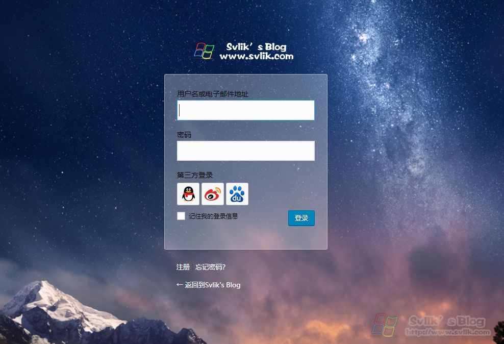
本站登录页面的美化效果:点击此处查看
首先打开你主题的functions.php文件,在最后添加上以下代码:
/**
* WordPress 登录界面美化
**/
function custom_login_style() {
    echo '<link rel="stylesheet" id="wp-admin-css" href="'.get_bloginfo('template_directory').'/admin-style.css" type="text/css" />';
}
add_action('login_head', 'custom_login_style');
在新建一个文本文档,改名为admin-style.css并添加以下代码,然后上传至functions.php同目录下,刷新你的登录页面看看,是不是变美了!
body{
    font-family: "Microsoft YaHei", Helvetica, Arial, Lucida Grande, Tahoma, sans-serif;
    width:100%;
    height:100%;
    background: url(http://ww1.sinaimg.cn/large/612ce624ly1fyv0xbije9j211y0lctb5.jpg) no-repeat;
    -moz-background-size: cover;    /*背景图片拉伸以铺满全屏*/
    -ms-background-size: cover;
    -webkit-background-size: cover;
    background-size: cover;
}

/*顶部的logo*/
.login h1 a {
    background:url(images/logo.png) no-repeat;
    background-size: 220px 50px;
    width: 220px;
    height: 50px;
    padding: 0;
    margin: 0 auto 1em;
    border: none;
    -webkit-animation: dropIn 1s linear;
    animation: dropIn 1s linear;
}

/*登录框表单*/
.login form, .login .message {
    background: #fff;
    background: rgba(255, 255, 255, 0.3);
    border-radius: 3px;
    border: 1px solid #fff;
    border: 1px solid rgba(255, 255, 255, 0.4);
    -webkit-animation: fadeIn 1s linear;
    animation: fadeIn 1s linear;
}

/*登录框输入框*/
.login label {
    color: #000;
}
.login .message {
    color: #000;
}
#user_login{
    font-size: 18px;
    line-height: 32px;
}

/* 返回博客与忘记密码链接 */
#backtoblog a, #nav a {
    color: #fff !important;
    display: inline-block;
    -webkit-animation: rtol 1s linear;
    animation: rtol 1s linear;
}

/*掉落的动画效果*/
@-webkit-keyframes dropIn {
    0% {
        -webkit-transform: translate3d(0, -100px, 0)
    }
    100% {
        -webkit-transform: translate3d(0, 0, 0)
    }
}
@keyframes dropIn {
    0% {
        transform: translate3d(0, -100px, 0)
    }
    100% {
        transform: translate3d(0, 0, 0)
    }
}

/*逐渐出现的动画效果*/
@-webkit-keyframes fadeIn {
    from {
        opacity: 0;
        -webkit-transform: scale(.8) translateY(20px)
    }
    to {
        opacity: 1;
        -webkit-transform: scale(1) translateY(0)
    }
}
@keyframes fadeIn {
    from {
        opacity: 0;
        transform: scale(.8) translateY(20px)
    }
    to {
        opacity: 1;
        transform: scale(1) translateY(0)
    }
}

/*从右往左的动画效果*/
@-webkit-keyframes rtol {
    from {
        -webkit-transform: translate(80px, 0)
    }
    to {
        -webkit-transform: translate(0, 0)
    }
}
@keyframes rtol {
    from {
        transform: translate(80px, 0)
    }
    to {
        transform: translate(0, 0)
    }
}

仔细瞅一瞅,到底怎么操作
2020-12-22 02:33